The client
CityBazaar is an online marketplace brand operating out of ITStarter Pvt Ltd. When they came to us the product was under active development — what they needed next was a visual identity that could carry the brand across web, packaging, team uniforms, storefront signage and printed marketing. Text-only Helvetica wasn't going to cut it.
The idea — one mark, three readings
The name starts with "b", so the letter had to do the work. We kept pushing until the lowercase b did three jobs at once:
- The letter — legible on first read, anchors the wordmark
- A shopping cart — the loop of the b reads as the cart's basket, with the descender as the handle
- A smile — two dots and a curved line tucked inside the loop turn the mark into a little face
Three readings in one symbol, none of them forced. The b is the b; the cart is the cart; the smile is just there, under the surface, showing up the more time you spend with the mark.
The visual system
Two colours, full stop.
- Sunshine Yellow —
#FED700, the primary. High-visibility, immediately readable on shelves, storefronts and screens. - Deep Navy —
#232F3E, the secondary. Grounds the yellow and carries the typography. - White — the only neutral. No beige, no grey, no secondary tints.
Two typefaces.
- Samoela — primary display. A friendly, slightly rounded sans that mirrors the curves of the logo mark.
- DM Sans — secondary body. Clean, highly readable, ships in every weight we need for UI, marketing copy and print.
The logo system
Three variants shipped, each solving a different surface:
| Variant | Use |
|---|---|
| Primary V1 — horizontal wordmark | Websites, wide headers, invoice letterheads |
| Primary V2 — stacked "city / bazaar" | Social avatars, square placements, packaging end-caps |
| Logo mark — the b icon alone | Favicons, app icons, vehicle livery, merchandise chest embroidery |
All three use the same glyph geometry, so switching between them feels like the same brand speaking at different volumes.
Clear-space rules
The guideline sheet documents clear space as a multiple of the x height of the mark (x/2 on sides, x on top and bottom for the wordmark; x/2 all round for the icon). Prevents the mark being crowded against other elements in print or signage.
Applied across touchpoints
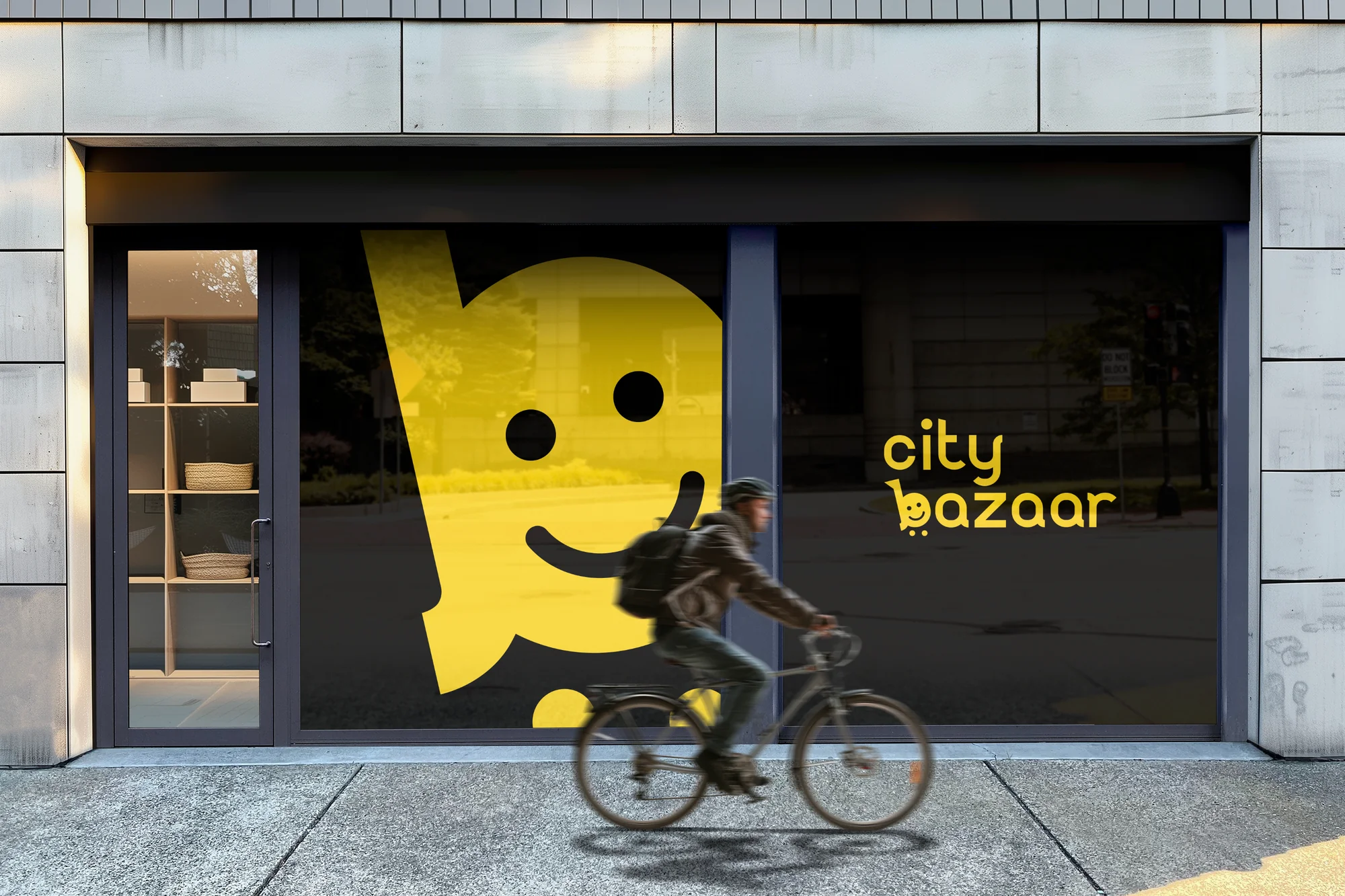
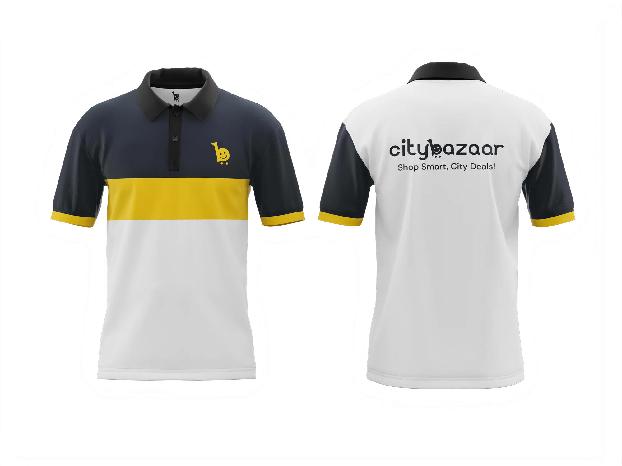
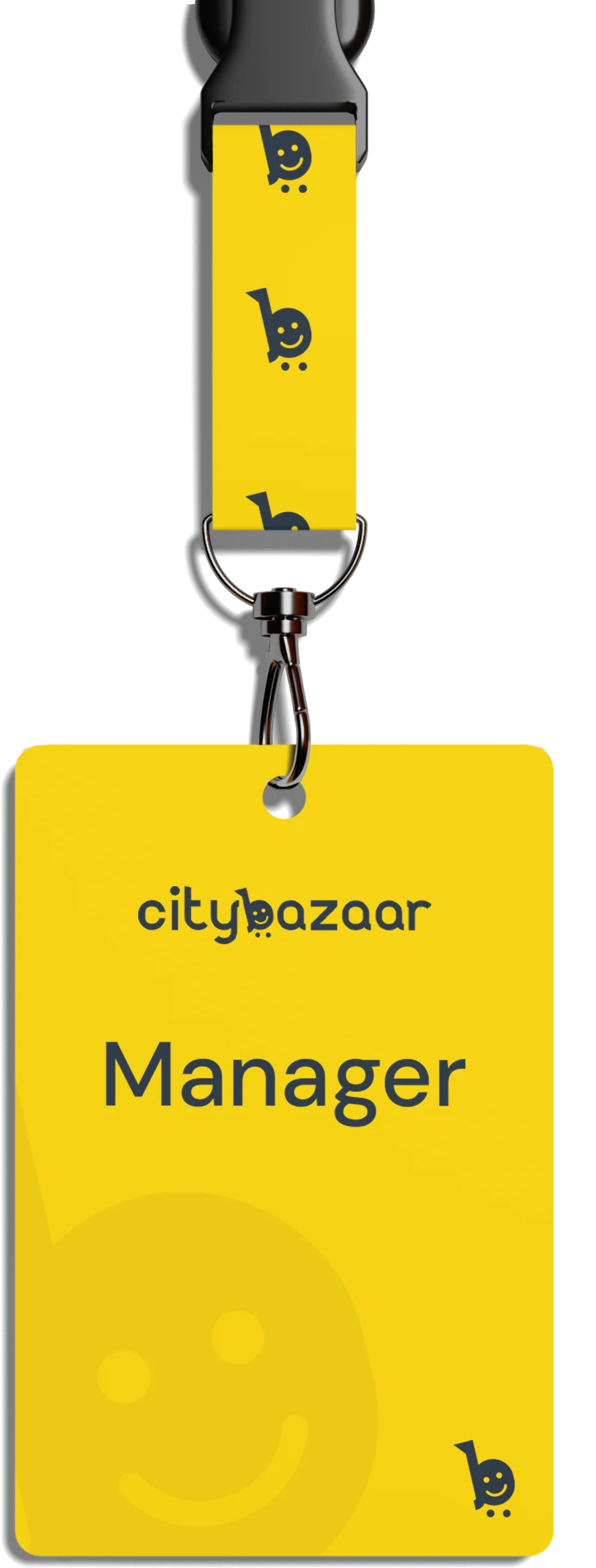
The guideline is only useful when the mark survives contact with the real world. We pressure-tested the identity across four surfaces before handing it over:
- Team polo (home in navy + yellow, away in white + navy) — chest mark, full wordmark on the back
- Storefront window vinyl — the
bat building scale, filling a shopfront, readable from across the street - Manager ID badge + lanyard — the icon repeats on the lanyard webbing; the card uses the stacked wordmark
- The guideline sheet itself — single A3 page documenting logo variants, clear space, colours, type, and the applied touchpoints
If it worked at building scale and lanyard scale, the system was ready for anything in between.
What we delivered
- Three logo lockups as vectors — SVG, AI, PDF, PNG at 512 / 1024 / 2048
- Logo concept one-pager explaining the b + cart + smile construction (for pitch decks and future designers joining the brand)
- Two-colour palette with hex + Pantone references
- Typography specs — Samoela primary, DM Sans secondary, with weight guidance
- Clear-space diagrams for every logo variant
- Four applied-mockup exports (polo, storefront, lanyard, guideline sheet)
- Single-page brand guideline PDF — the source of truth for anyone applying the mark
What we kept out
Honest scope — we did not build the marketplace itself, nor the website. The CityBazaar product team runs the platform. Our brief was the visible identity, and that's what we delivered. If a brand refresh of the web UI ever comes back onto our plate, the mark, colours and type are already decided.
What the client said
Text-only for two years. Then we gave them the name and got back a mark that's three things at once — the letter, a shopping cart, and a smile. The team sees it every day now and it still hasn't got boring. — Client, CityBazaar