The brief
Active Cars is a UK private-hire taxi company. They came to us with a name and nothing else — no mark, no colour system, no guidelines. The fleet was already on the road, unbadged, losing passenger recognition to competitors with sharper visual identities.
One line of brief: "Here's our name — we need a logo."
The idea — we saw the V as a tick
No one asked us for a checkmark. Reading the name on paper, we noticed one letter doing more work than it had to: the V.
Rotated in our heads, the V was already a tick. We leaned into it.
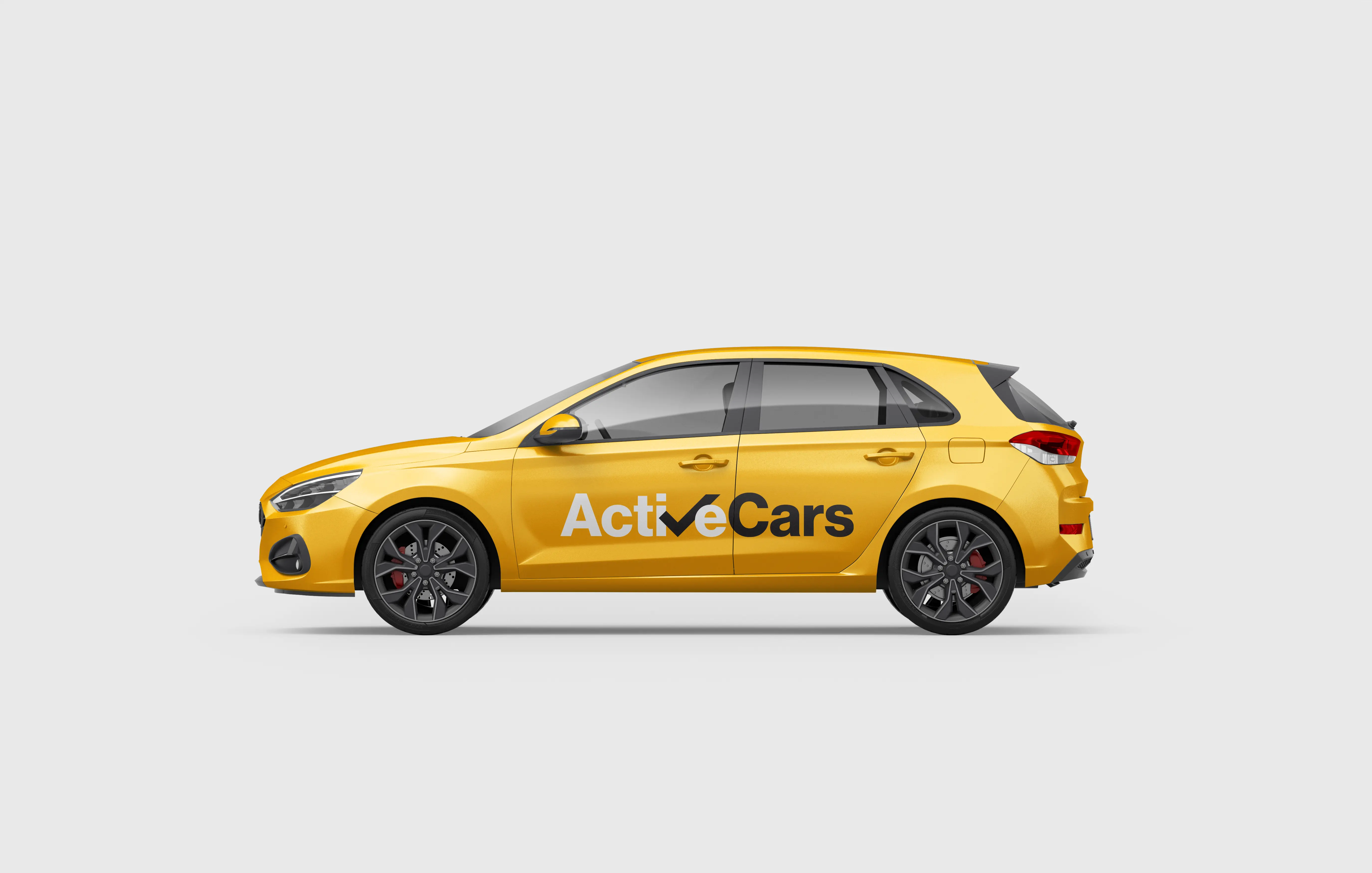
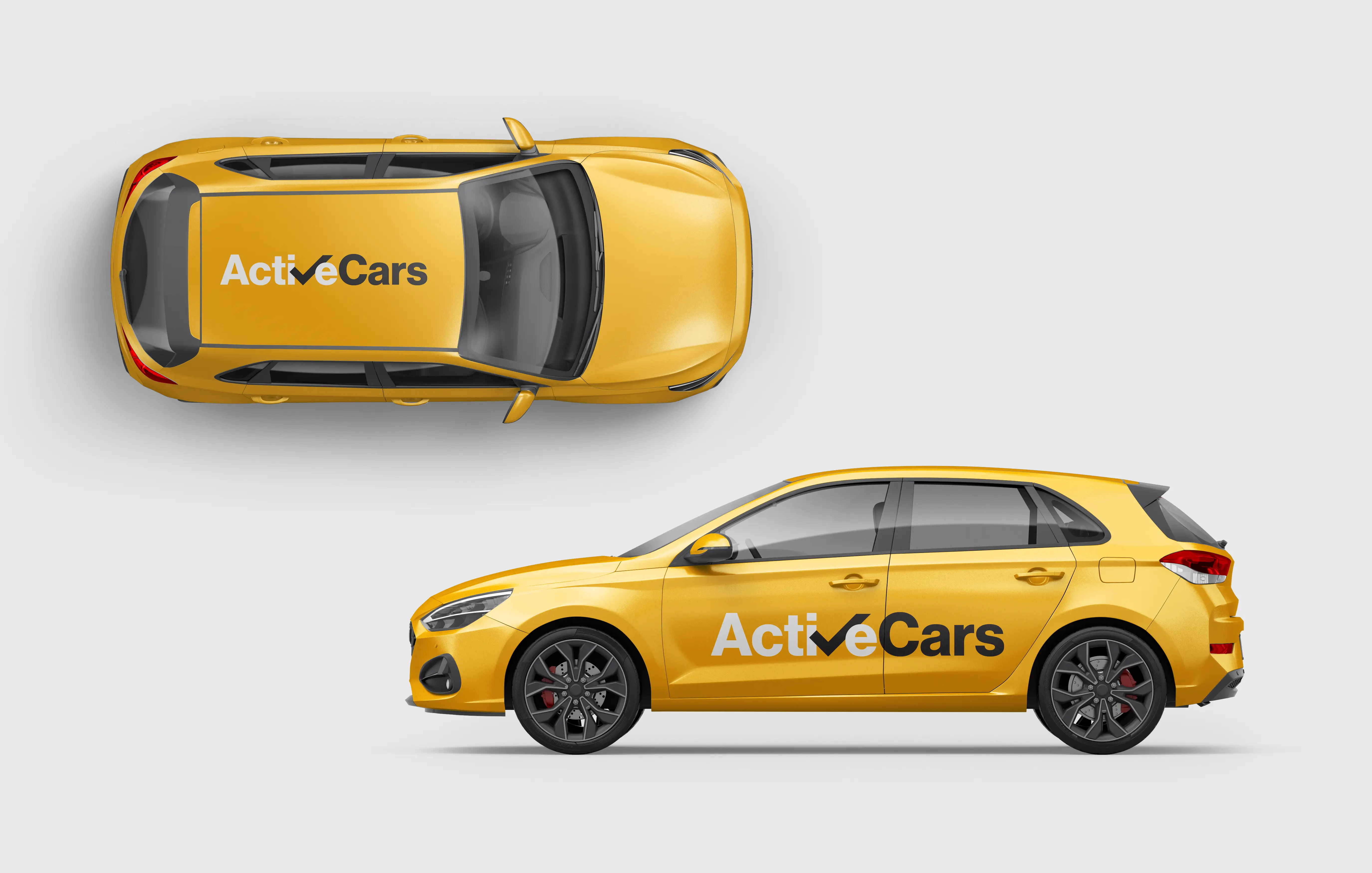
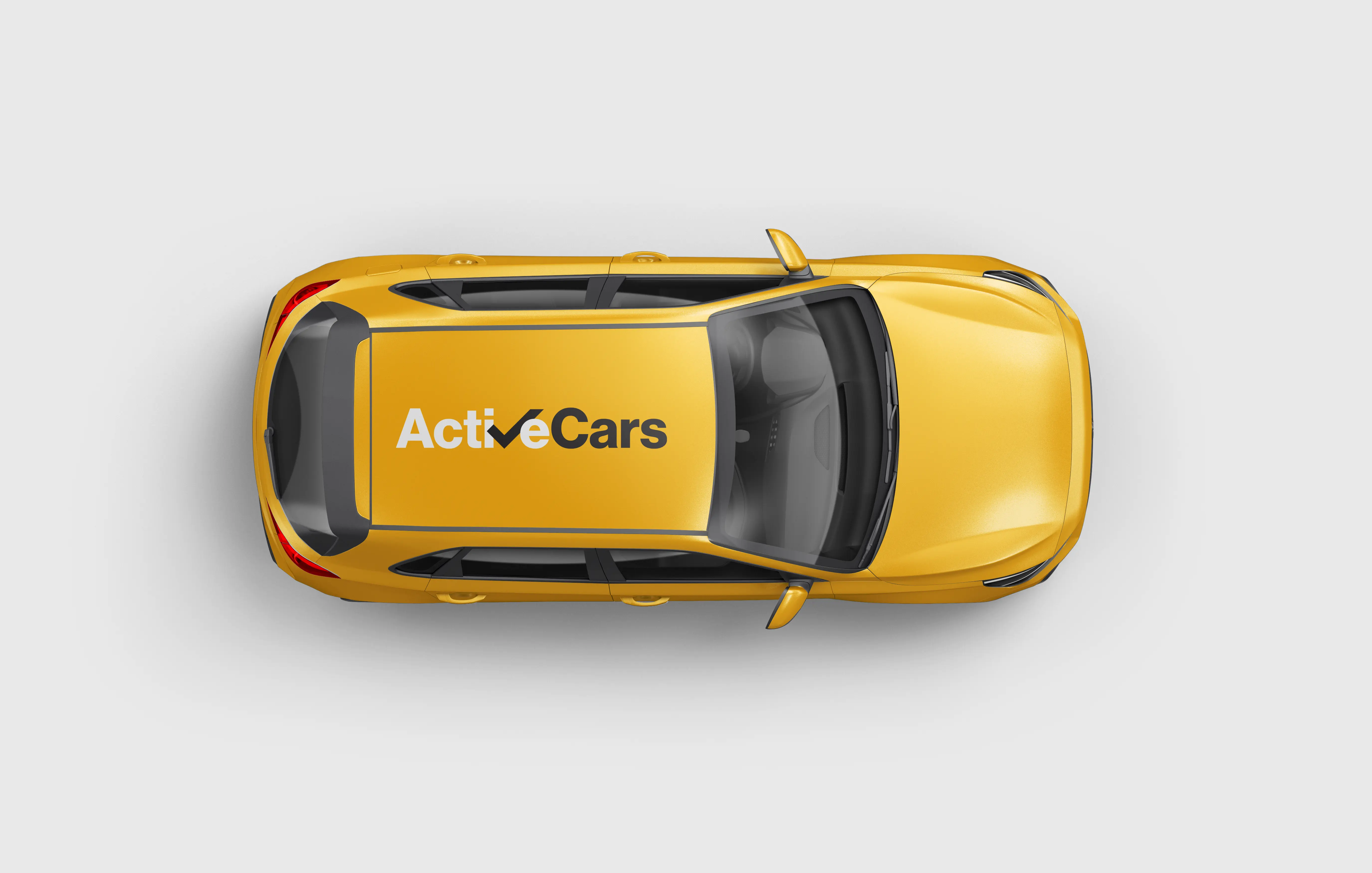
The V becomes a tick. That single design move turned a six-letter wordmark into a trust signal — which is exactly what a private-hire company needs customers to feel when a yellow car pulls up. The wordmark reads as "ActiveCars" on first glance, and the tick only reveals itself on the second read. That second-read moment is the mark's real job — licensed, on-duty, ready to go.
No separate icon, no secondary symbol. One letter, doing two jobs — and the client never asked for either of them.
Why that works for this business
A private-hire mark has to do four jobs, and it has to do them at wildly different sizes:
- Full-size vehicle livery — doors and bodywork readable from across a street
- Small-print surfaces — business cards, receipts, licence-plate stickers
- Digital avatars — booking-app icon, Google Business Profile, WhatsApp display picture
- Signal legitimacy without spelling out a word like "licensed"
A tick embedded in a letter the name was already built around does all four — no second mark, no simplified variant needed for small sizes.
Two deliberate craft choices
- The V carries extra weight. Lighter strokes let the tick fade into the wordmark — we tested it and the second-read effect collapses. Heavier and it reads as a separate symbol stuck onto the text. The current weight is the narrow band where both readings stay legible.
- "Active" white, "Cars" black. The palette split is what anchors the tick. Remove the contrast and the tick loses its silhouette against the rest of the word.
The system
Two colours, one typeface, one layout.
- Active Yellow for the vehicle base / primary surfaces
- Pure Black for all typography and the tick geometry
- Pure White as the optional inversion for dark backgrounds
No gradient alternatives, no secondary marks, no "pick from the set". The whole point is that it works once, correctly, everywhere. The usage guide fits on a single A4 page.
Deliverables
- Master wordmark vectors (SVG + AI + PDF + PNG at 512/1024/2048)
- Tick geometry extracted as a standalone mark (for windscreen stickers, favicons, in-app "driver confirmed" indicators)
- Two-colour system with hex + Pantone references
- One-page usage guide — clear-space rules, minimum size, dos and don'ts
Results · what shipped
🇬🇧 UK client · fleet now branded consistently across every surface.
- Every vehicle in the fleet now carries the wordmark on roof and doors · one mark doing all the heavy lifting across roof livery, door panels, windscreen stickers
- Driver uniforms re-kitted with the same mark — polo shirts and jackets match the vehicles without pattern clash
- Digital identity unified · booking-app avatar, Google Business Profile, WhatsApp display picture, receipt templates all now run the same mark at the right proportion
- "Is that Active Cars?" — the passenger recognition signal the business didn't have six weeks earlier
The mark's real measure: a yellow taxi with this wordmark now reads as Active Cars from across a street, not another unbranded private-hire vehicle. That recognition compounds every day the fleet is on the road.
What we kept out
Honest scope disclosure — we did not build the booking app, the driver portal, or a website. Active Cars runs on an off-the-shelf private-hire dispatch platform and has an in-house person managing their customer-facing site. Vehicle wraps were printed by the client's existing livery supplier using our handed-over vector files.
Our brief was the mark itself. That's what we delivered, and we handed it over in fourteen days.
What the client said
We gave them a name and expected a logo. What we got back was a logo that means something — a tick hiding inside our own brand name. Nothing we would have thought to ask for. Two weeks, one mark, the whole fleet suddenly looked like a real business. — Client, Active Cars