The client
Arzam Physics is a Sri Lankan physics tuition brand run by an A-level tutor based in Colombo. The business had a name and a reputation; what it didn't have was a visual identity that could hold together across billboards, booths, student handouts, and merch.
The brief — from ITStarter Pvt Ltd, who'd packaged the work with its own studio team (the same team behind CityBazaar) — was to design the whole brand system from scratch. Logo, colour, type, applications, one brand book.
The idea — one mark, four readings
The name gives you two letters to work with: A and P. We pushed until both letters sat inside a single glyph, and then kept pushing until that glyph was doing more jobs than just spelling the brand.
- The letter A — anchors the wordmark, read first
- The letter P — tucked into the counter of the A, read second
- An open book — the two halves of the A read as pages, a nod to teaching
- A downward arrow — the negative space inside the P points down: gravity, the one force every physics student meets first
Four readings, one symbol. None of them shouted, none of them forced — the letters do the heavy lifting, the book and the arrow show up the longer you look.
The tagline was given: "The untold story of physics." We set it in a ring around the mark on the primary lockup so the tagline and symbol travel together on signage and badges.
The visual system
Four colours.
- Primary Blue —
#0056D2. Deep, trustworthy, immediately readable on outdoor signage and in print. - Secondary Yellow —
#F7AA00. The accent — used sparingly for highlights, callouts, and the ring typography on the primary lockup. - Off-white —
#F9F8FF. The quiet neutral — backgrounds, body text pages, negative space. - Near-black —
#0F0F0F. Display type, rules, deep-field applications like the hoodie.
Two typefaces.
- Raleway — primary display. A geometric sans with a wide weight range; carries headlines, the wordmark, and the ring type around the mark.
- Roboto — secondary body. Neutral, highly legible in long copy and at small sizes on business cards, letterheads, and handouts.
Applied across touchpoints
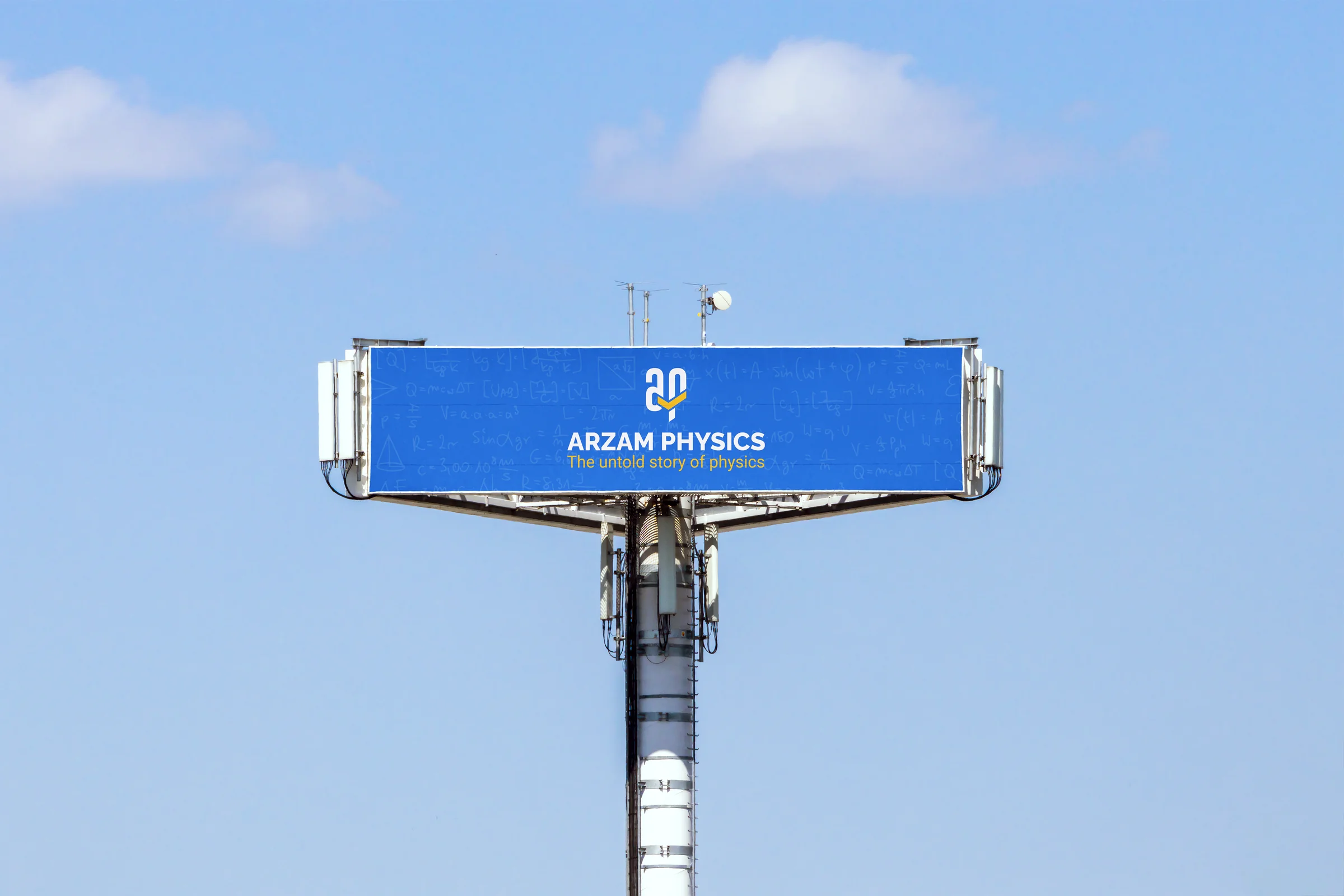
The brand book was only useful if the system survived contact with the real world. We pressure-tested the identity across five surfaces before handing it over:
| Touchpoint | What it proves |
|---|---|
| Roadside billboard | Mark + tagline stay legible at distance; blue holds against a busy formula-chalkboard background |
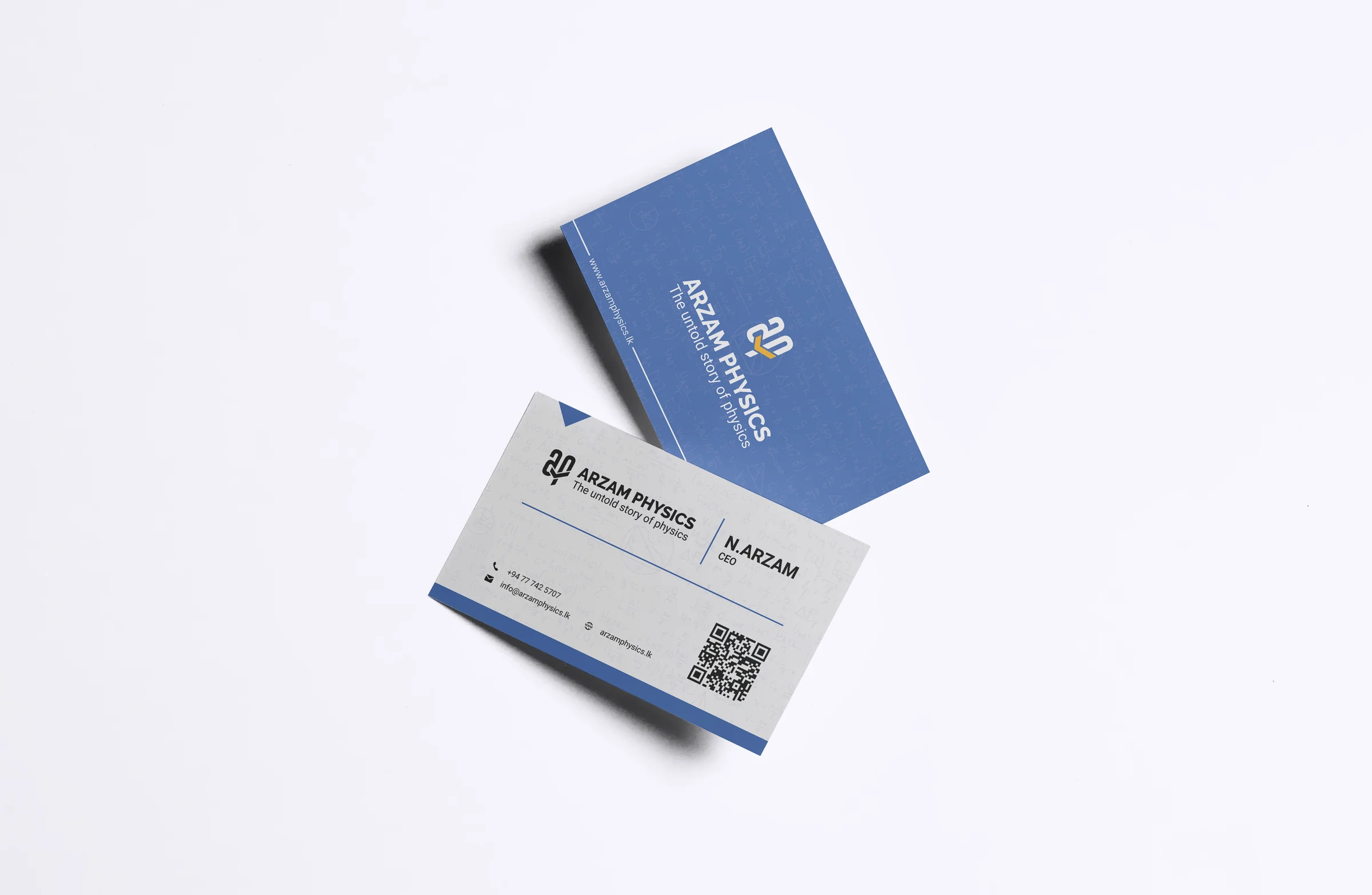
| Business card (front / back) | Mark at small scale on blue stock; contact block (name, role, phone, email, site) in Roboto on the white reverse |
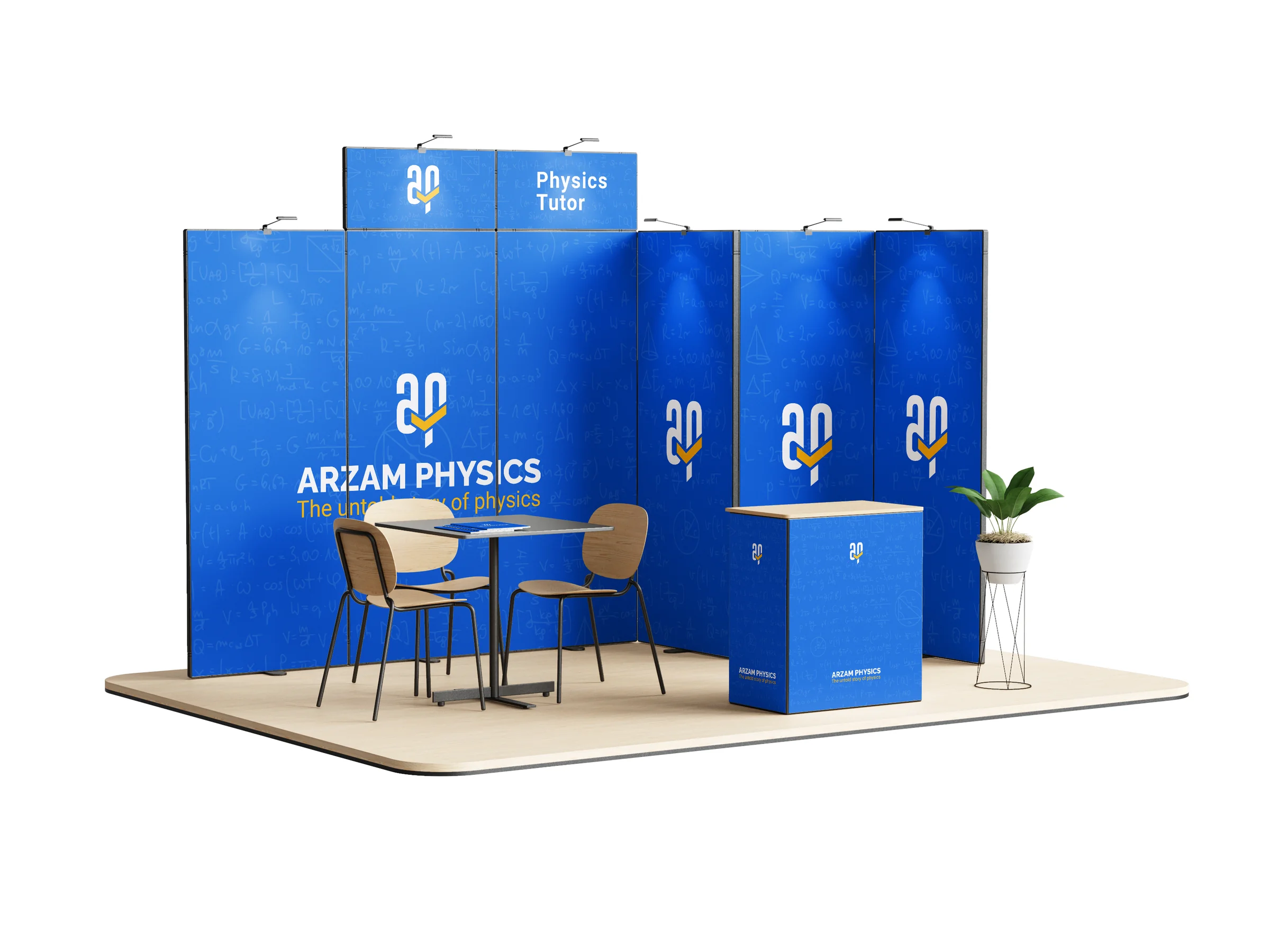
| Exhibition booth | Repeating mark at pattern scale; blue panel system reads as a brand before the visitor reads a word |
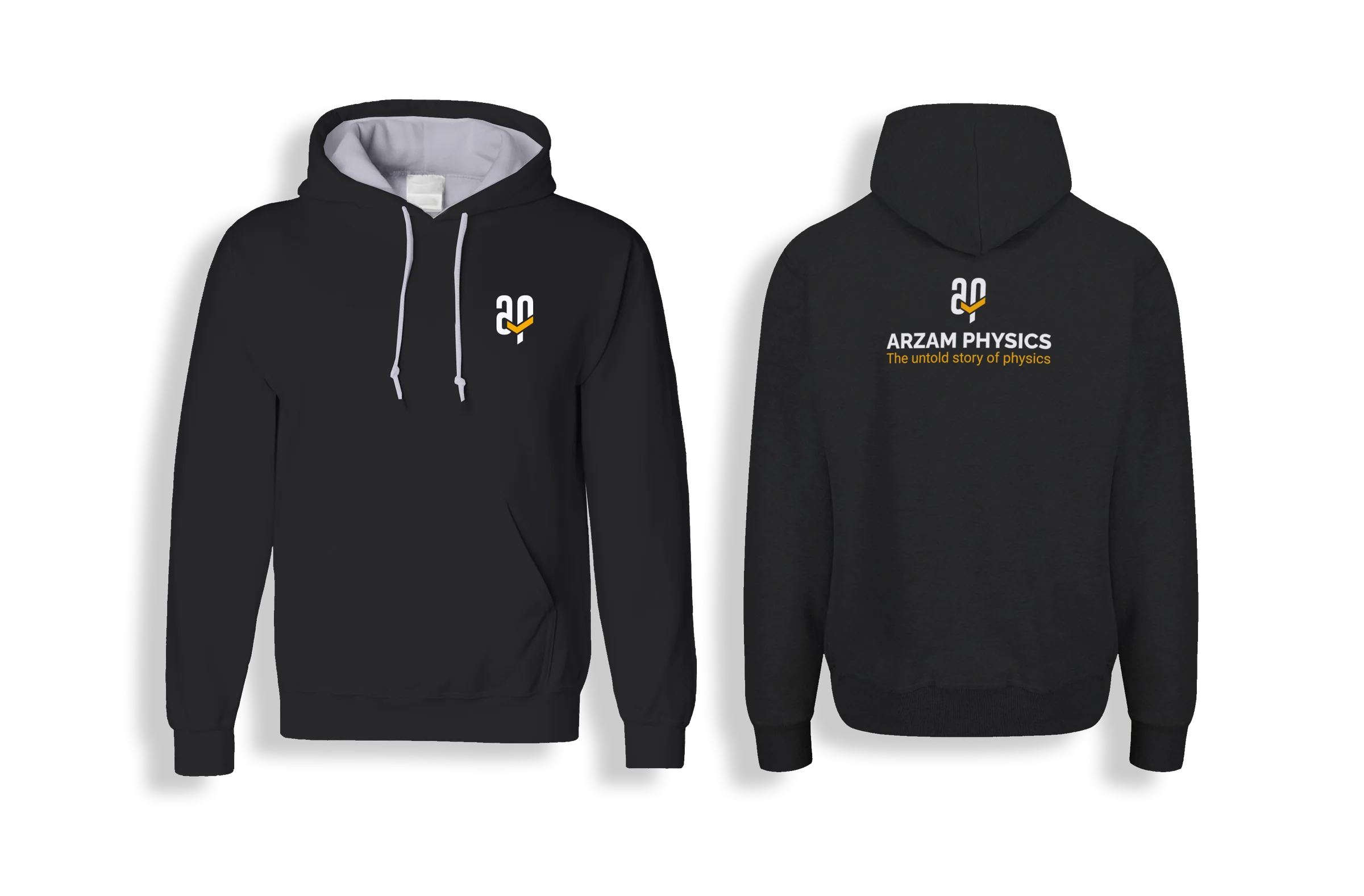
| Hoodie (front / back) | Mark at chest scale; full wordmark stretched across the back — tests the lockup at apparel proportions |
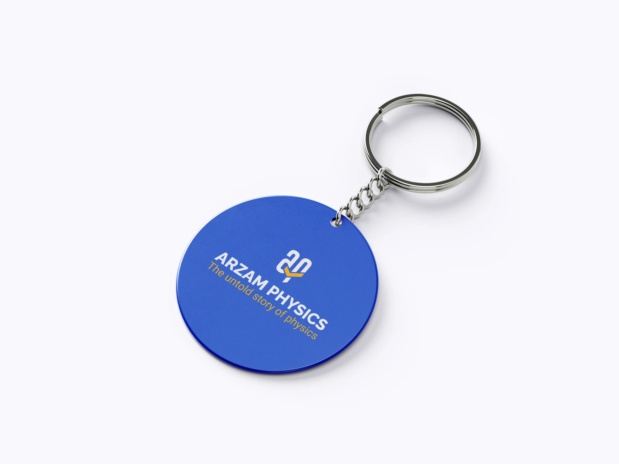
| Keychain | The circular lockup with tagline ring works at 40mm — smallest useful scale in the system |
If it held at billboard scale and keychain scale, the rest of the brand was safe.
What we delivered
- Logo lockups as vectors — the horizontal wordmark, the stacked primary mark with tagline ring, and the standalone icon, each in full-colour, reversed, and monochrome
- Four-colour palette with hex references
- Typography specs — Raleway primary, Roboto secondary, with weight guidance for display and body
- Applied mockups — billboard, business card, exhibition booth, hoodie, keychain
- Brand book PDF — single document, explaining the logo concept, colour, type, and the applied touchpoints
What we kept out
Honest scope — we did not build the website, the course platform, or any digital products for Arzam Physics. The brief was the visible identity, delivered as a brand book with applied mockups. Claims of course sign-ups, search rankings or revenue uplift belong to the tutor's teaching, not to us.
What the client said
They came back with a mark that reads as an A, a P, an open book and an arrow — all at once — and I still notice something new in it months later. — Founder, Arzam Physics