The client
Lotus AVK Engineering Pte Ltd is a Singapore construction and renovation firm operating out of Woodlands Industrial Park. They cover the full stack — interior design, carpentry, demolition, plumbing, painting, electrical, and general construction — and they're BCA-registered and bizSAFE 3 certified.
When they came to us they already had the things a working construction business had in 2024: a name, a logo, a site, a phone number that rings. What they didn't have was a leave-behind. Something a site manager could hand a potential client at the end of a walk-through, or that reception could stack on a counter at Harvest @ Woodlands. Paper, not pixels.
The brief — one printed object
A single DL trifold, six panels. Do everything on that one sheet. No second brochure, no variant per service, no "capabilities deck" sitting in someone's inbox. Scoped to one object that could come off a press in bulk and travel in a polo pocket.
The layout — what lives on which panel
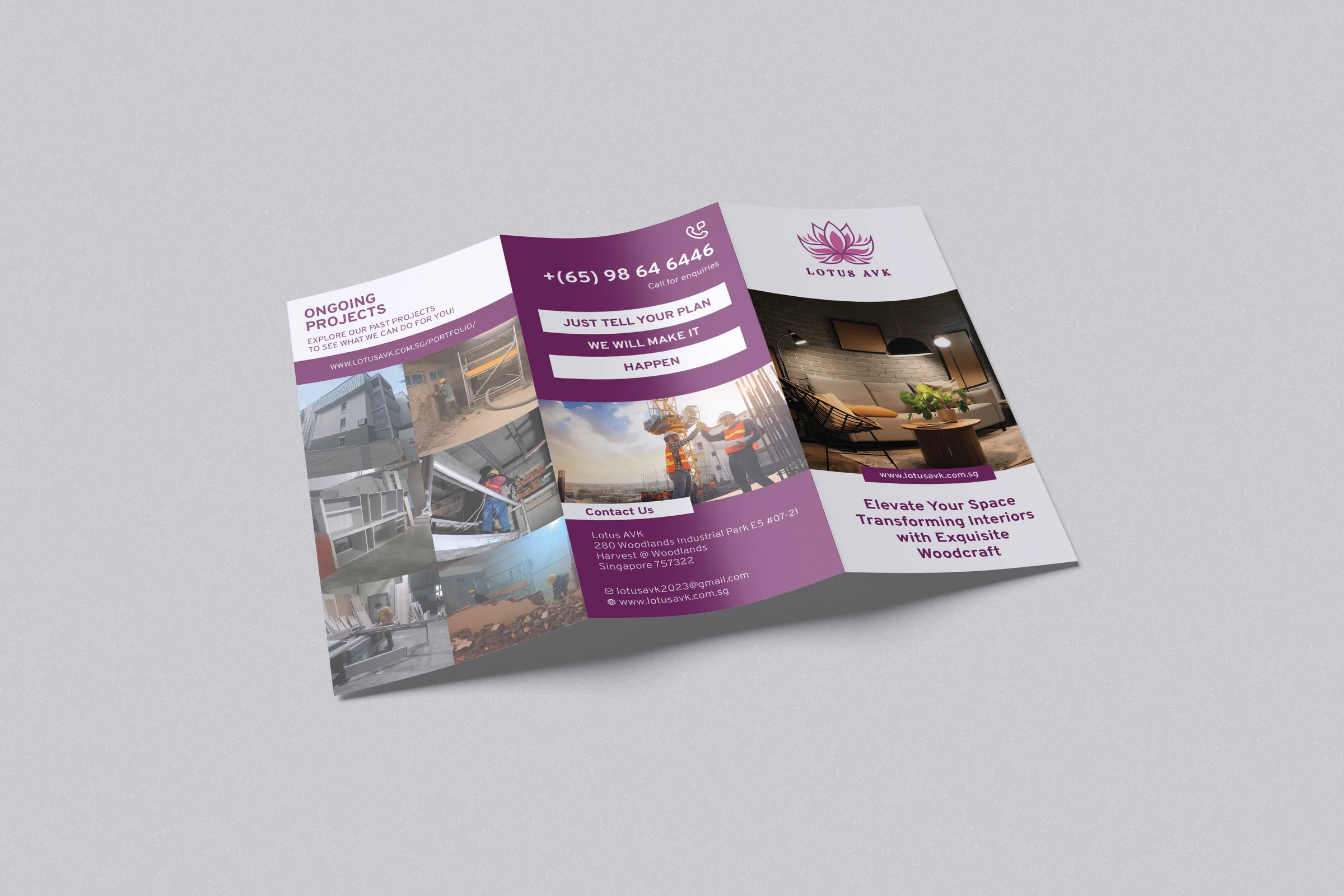
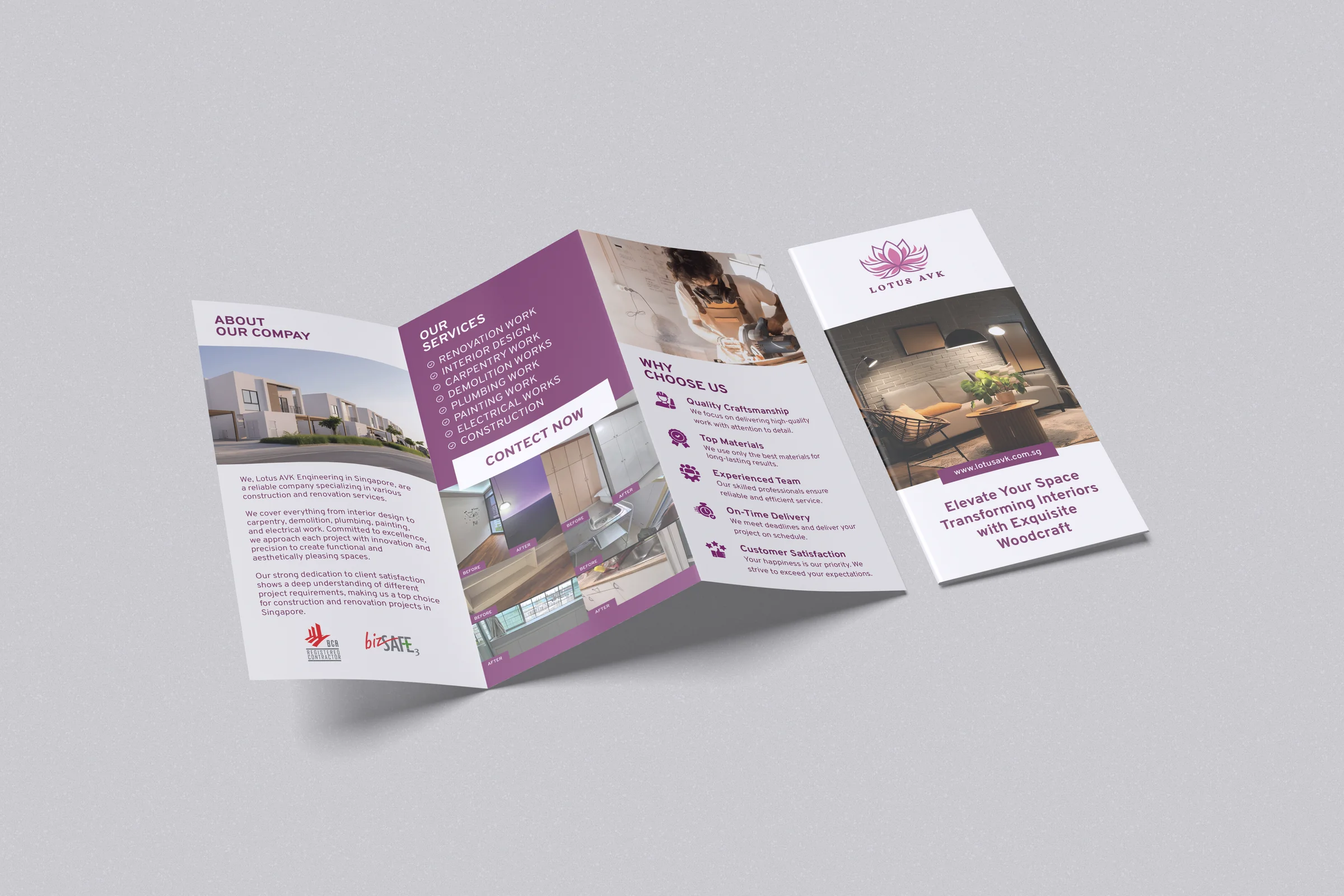
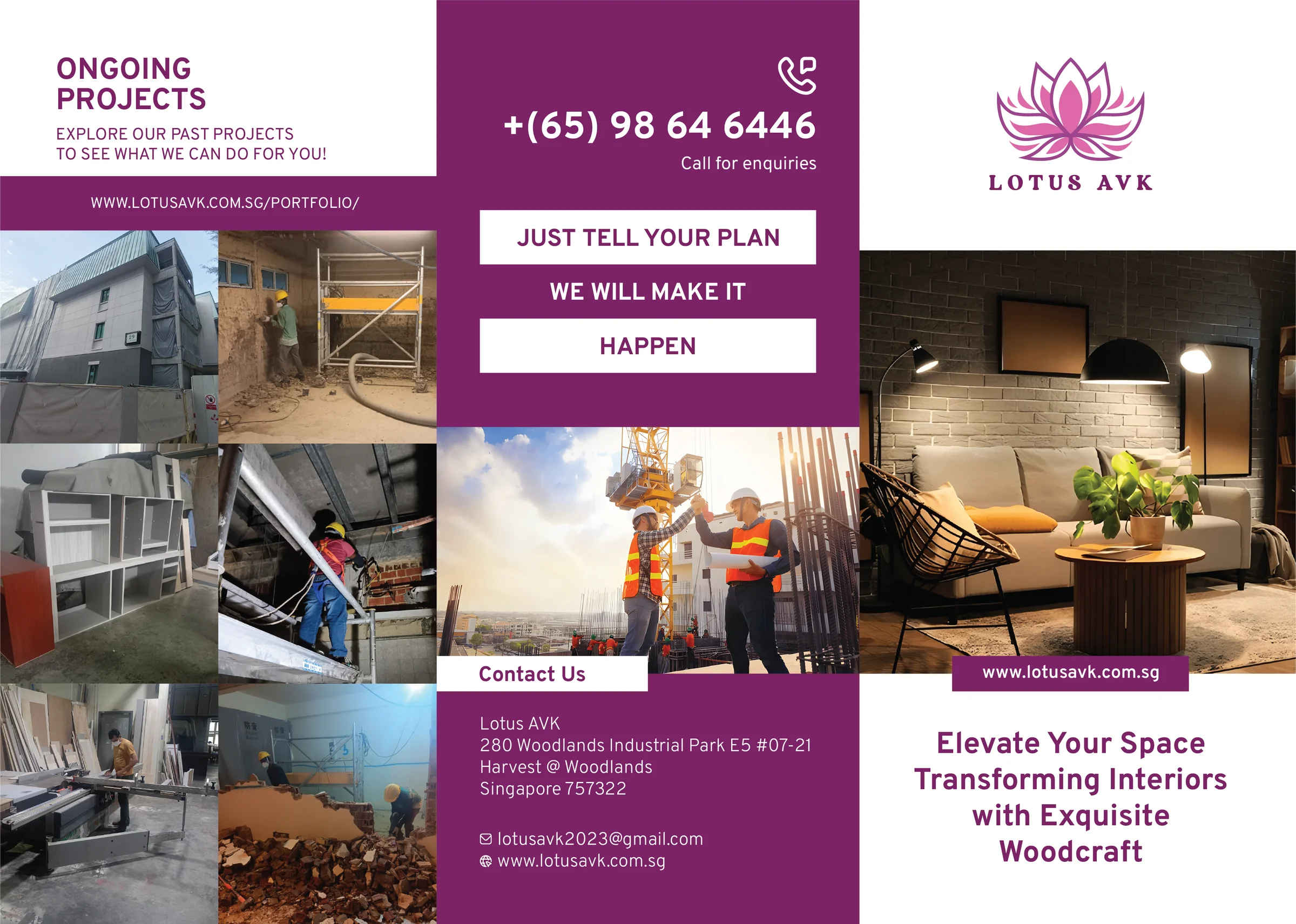
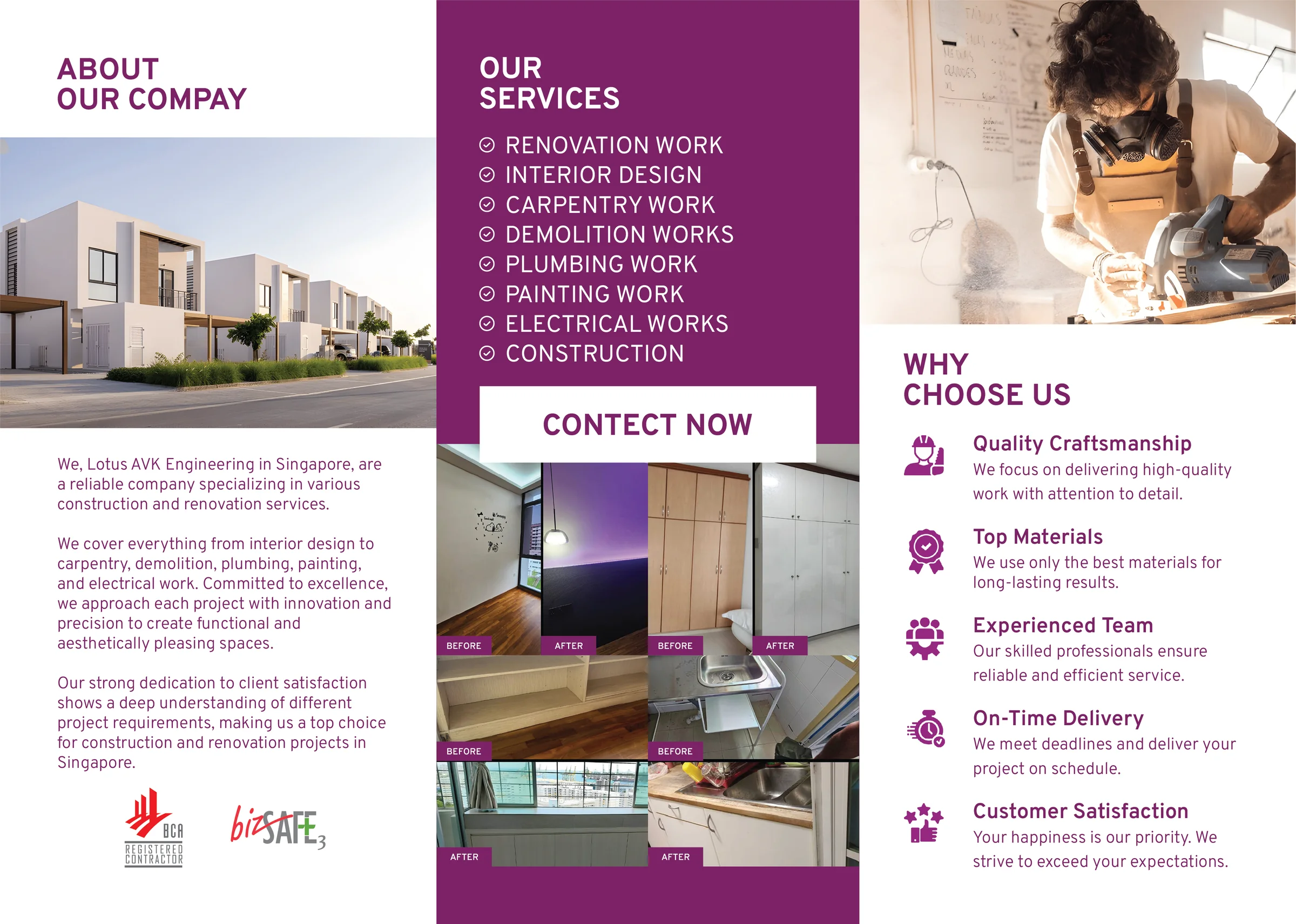
Trifolds read in a predictable order, so we loaded the panels in the order the reader meets them:
| Panel | What it carries |
|---|---|
| Front cover (outside-right) | The lotus mark, a single warm interior hero shot, the tagline "Elevate Your Space — Transforming Interiors with Exquisite Woodcraft", and the URL. Everything below the fold is about earning the unfold. |
| Contact pillar (outside-middle) | Purple panel, phone number hero-sized, the "Just tell your plan — we will make it happen" three-line statement, a construction-site photo, and the full postal block + email + URL. The only page that has to work on its own if the brochure is folded the wrong way. |
| Ongoing projects (outside-left / back) | Six-up photo grid of live sites — scaffolding, cladding, interior rough-in, rubble-to-clean. A link to lotusavk.com.sg/portfolio/ for anyone who wants the long version. |
| About (inside-left) | One photo (a completed exterior), three short paragraphs, the BCA + bizSAFE badges at the foot. The panel that earns credibility when someone reads past the cover. |
| Services (inside-middle) | Eight services as a clean checked list, a purple "CONTACT NOW" pill as the page's ask, and a stacked before/after pair of kitchen photos to prove the list is real work, not copy. |
| Why choose us (inside-right) | Five reasons as bullets — quality craftsmanship, top materials, experienced team, on-time delivery, customer satisfaction. Each one a line, each one with an icon, short enough that the reader finishes the panel. |
The visual system
Purple, white, photography. The house magenta (already the client's brand colour) carries every block of type that isn't a heading, every pill, every accent stripe. White is the only neutral. Photography does the heavy lifting on every panel — interior hero on the front, site photos in the middle, before/after pairs on the inside.
Two typefaces. A geometric sans for headlines and the phone-number hero, and a workhorse neutral sans for body copy. No decorative type — the brochure is read in ten seconds on a site doorstep, not over coffee.
Applied
- Print-ready PDF — CMYK, 300 dpi, 3 mm bleed, crop marks, trim-safe text all pulled in from the fold lines. Sent to the printer without a single round of revisions.
- Digital share version — a flattened RGB PDF + PNG exports of each panel, for WhatsApp and email follow-ups.
- Mockups — two render views (front-panel and opened-inside) used on the client's site and socials.
What we kept out
Honest scope — we did not design the Lotus AVK logo or website. Both were in place before we came in. Our job was the trifold: layout, print setup, photography selection and sequencing across six panels, one printed object.
What the client said
We needed something to hand people at the end of a site visit. One page. Folded. Readable in a lift. That's what they made us. — Client, Lotus AVK Engineering