The client
Velora Homes is a UK property-management brand based in Leicestershire. They work with three audiences who rarely see the same website well · investors who want returns, landlords who want the hassle off their plate, and tenants who want to live somewhere that actually gets fixed when it breaks.
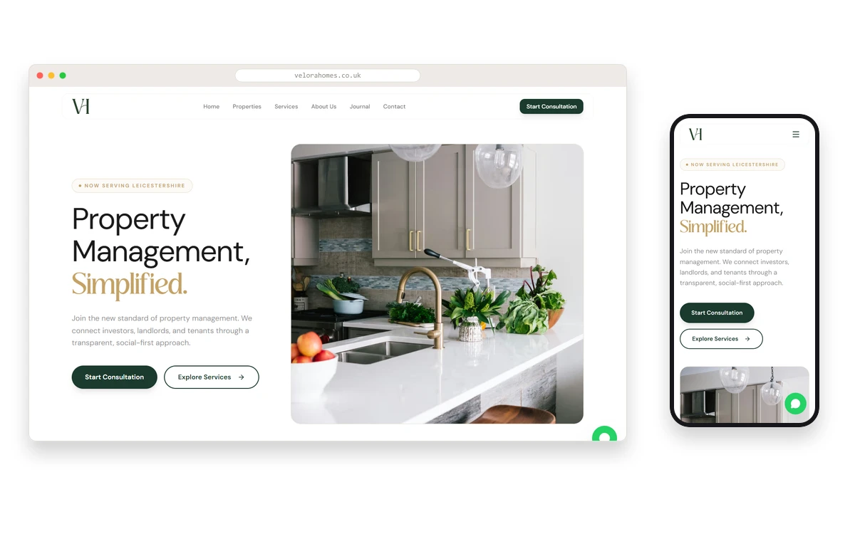
The brand leads with "Property Management, Simplified." · a deliberate stance against the fragmented quote-a-quote-a-quote culture that dominates UK lettings.
The brief
Build a storefront that feels more like a service brand than a lettings agency. The site had to:
- Hold three audiences (investors, landlords, tenants) without forcing a menu choice in the first five seconds.
- Feel local to Leicestershire while leaving room to expand.
- Lean into a social-first tone · consultative, transparent, not the "tick your Rightmove box" shortcut.
- Convert visitors into a booked consultation, not a generic enquiry form.
What we built
- Editorial homepage with a product-grade hero image (kitchen interior) rather than a stock "keys in hand" shot · sets the quality bar immediately.
- Clear service arms · Properties, Services, About, Journal, Contact · one menu, no marketing-speak detour.
- Start Consultation CTA as the primary action across every page, not a buried form · the entire site is optimised around that one conversion.
- "NOW SERVING LEICESTERSHIRE" locality chip above the hero · honest scope today, expandable tomorrow.
- Journal section for content marketing · tenant guides, landlord playbooks, area spotlights · the SEO + trust layer.
- On-brand palette · dark green + cream + warm gold · reads as premium without drifting into corporate-lettings beige.
Why it's on the portfolio
Velora Homes is a good example of an industry where templates normally win by default and shouldn't. Property management sites almost always look the same · property grid, book viewing, end. This one bets on positioning and service writing as the real product · the grid and the enquiry flow sit underneath, supporting, not leading.