The client
Sameeha Family Restaurant is a small family-run restaurant. The name Sameeha has Arabic roots ("generous, forgiving") and the owner wanted a mark that felt warm and family-owned — not a chain — and that carried a hint of that Arabic origin without being hard to read on a shopfront or a printed card.
The brief — one wordmark, one icon
Small, scoped commission. Two deliverables:
- A primary wordmark — Sameeha Family Restaurant — that could carry a sign above the door and print clearly at business-card scale.
- A circular icon — for favicons, app tiles, profile avatars and menu-corner stamps, where the full wordmark would shrink past the point of readability.
That's the whole scope. No brand book, no stationery system, no menus, no packaging — just the two lockups in vector, clean.
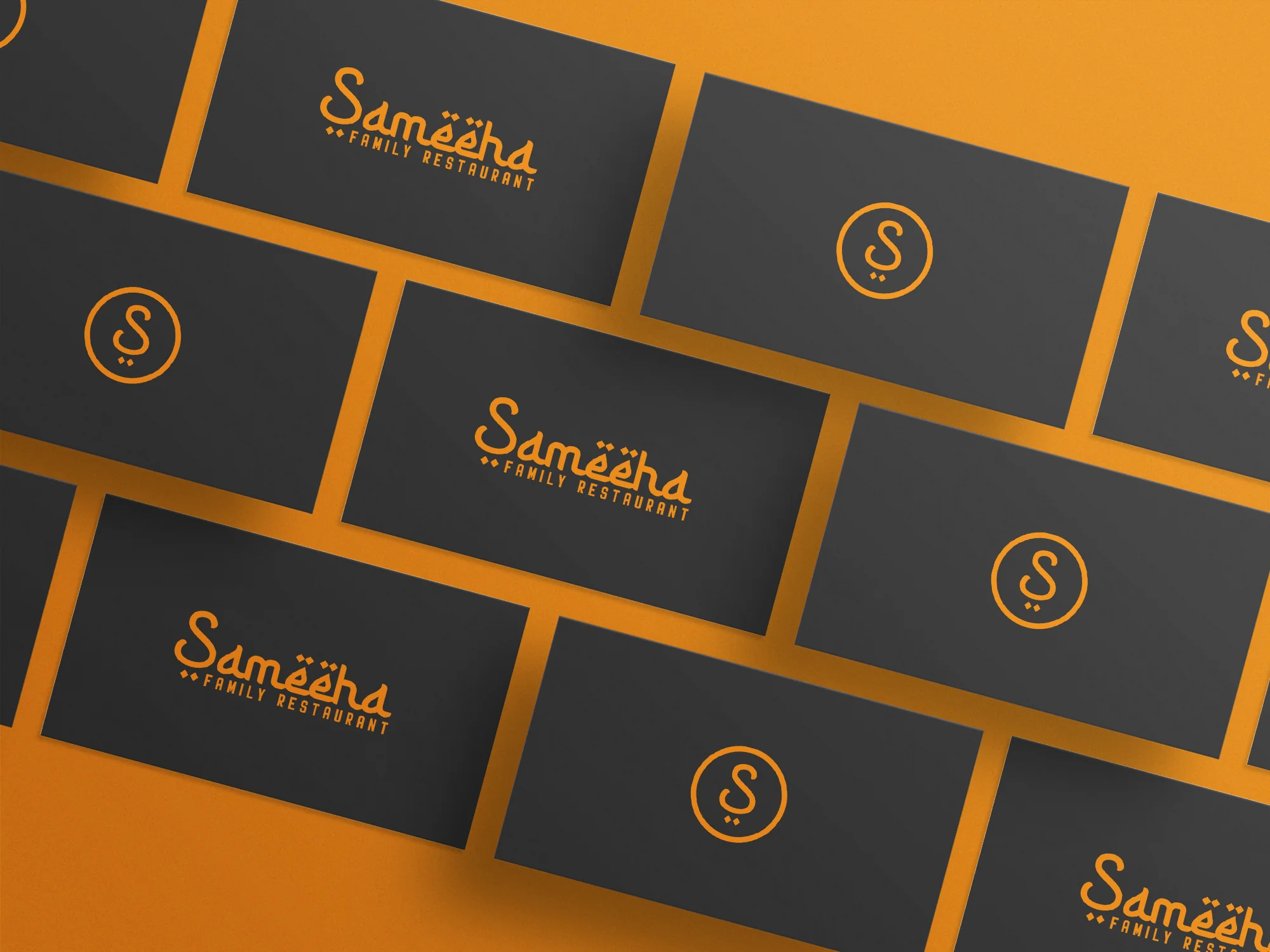
The idea — the two-dot tie
The name reads best as a single flowing script, not as stiff block caps. We drew Sameeha as a warm, slightly sloped script with Arabic-inspired diacritic dots sitting above the "ë" pair — a small nod to the name's origin without turning the word into a costume.
Family Restaurant sits under the script in clean geometric caps, so the mark has one loud voice and one quiet voice in the same lockup.
The signature detail is the two dots, placed under the word on the wordmark and under the "S" inside the circle on the monogram. That pair of dots is what makes the wordmark and the icon read as the same brand instead of two unrelated marks. Without them, the monogram would feel generic; with them, the icon is unmistakably the restaurant's.
The visual system
One colour. The house orange — warm, appetite-friendly, readable over dark backgrounds. No secondary, no tints. The brief didn't ask for a palette and we didn't invent one.
Orange on dark was the tested pairing: the mockup render laid the marks over near-black business cards so the orange read clean in the one contrast scenario the owner cared about.
What we delivered
- Primary wordmark — vector (AI + PNG), orange on transparent
- Circular "S" monogram — vector, matching orange, with the two-dot signature
- Mockup render — business cards laid out for the owner to share the mark with family and staff before print
What we kept out
Honest scope — this was a logo-only commission, delivered over WhatsApp in a couple of rounds. We didn't build a brand book, design stationery, set type rules, or do any applied touchpoints beyond the single mockup render.
What the client said
They gave me one mark and one icon and they already match. That's all I needed, and that's exactly what they made. — Client, Sameeha Family Restaurant
